Along with the innovative system and packaging design, the website of Levitation is an important bridge to connect with the audience. As a brand targeted to Generation Z, this online presence for the brand is not only for shopping, but supporting social networking. It encourages people to share impressions of the brand to connect other Levitation consumers, or to be an influencer on Instagram and Youtube. Here, people can meet new friends and learn more about their lifestyles.
Application: Adobe XD, Figma, Adobe Premiere
Workflow
Create Task Analysis. To identify the website’s main functions, as well as to find opportunities to develop a better user experience for customers, I created three personas: a stressful student would like to try destress drinking; a stressful designer who were addicted into tea drink; a young influencer who loved sharing new products on her social channels. Those potential consumers' behavior helped me identify the main functions of the website. And the influencers' user experience could be a selling point of the brand because at present, following influencers is popular among young Americans to learn about new products and make consumer decisions (Morning Consult, 2019). Influencer could be the bridge to connect new consumers and the brand. To activate this connection, I designed a special page called #MyLevitation for people where they can share impressions of the brand via Instagram and YouTube (images below).
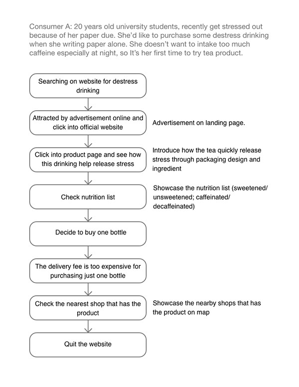
Task Analysis 1
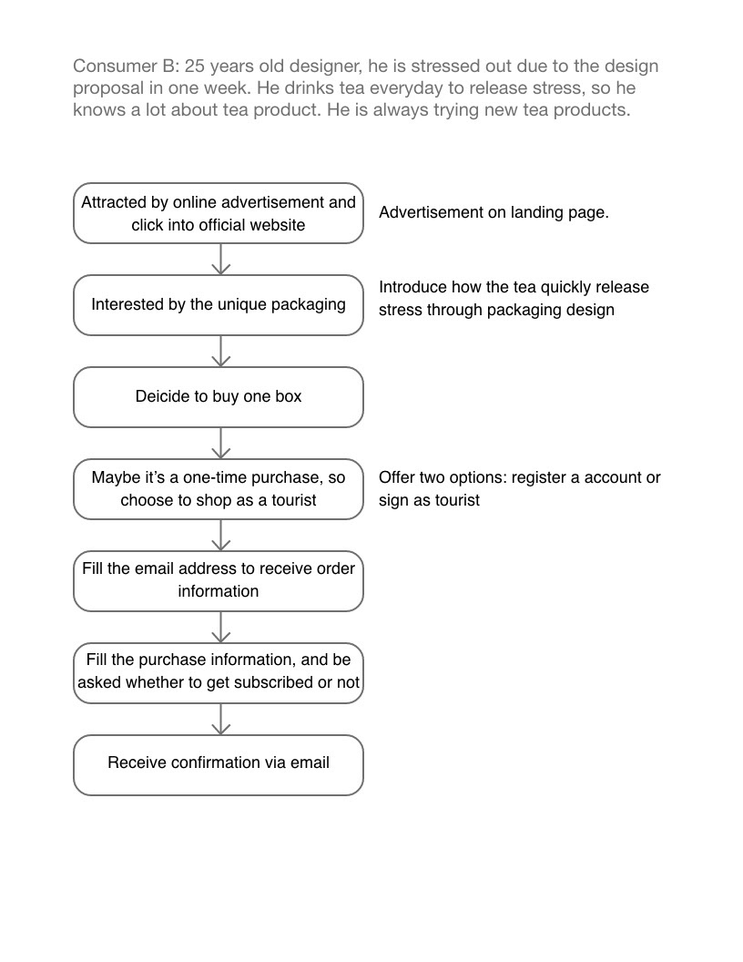
Task Analysis 2
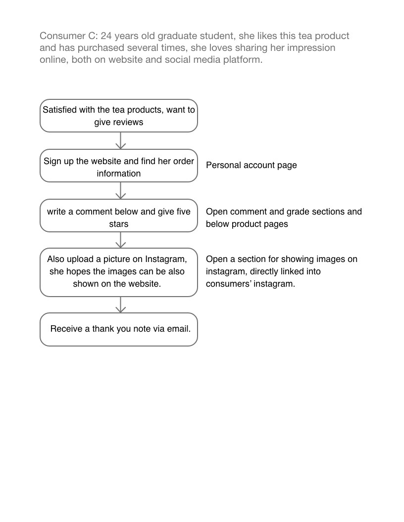
Task Analysis 3
Build Task List. To find out every possible situation of customers' requirements.
Build Website Structure. to simplify and maximize the functionalities of each page, I summarized the website structure.
Build Framework. To develop a clean, pragmatic website design and communicate with web developer in case for further needs, I built framework of each pages.
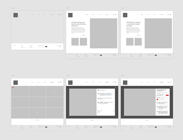
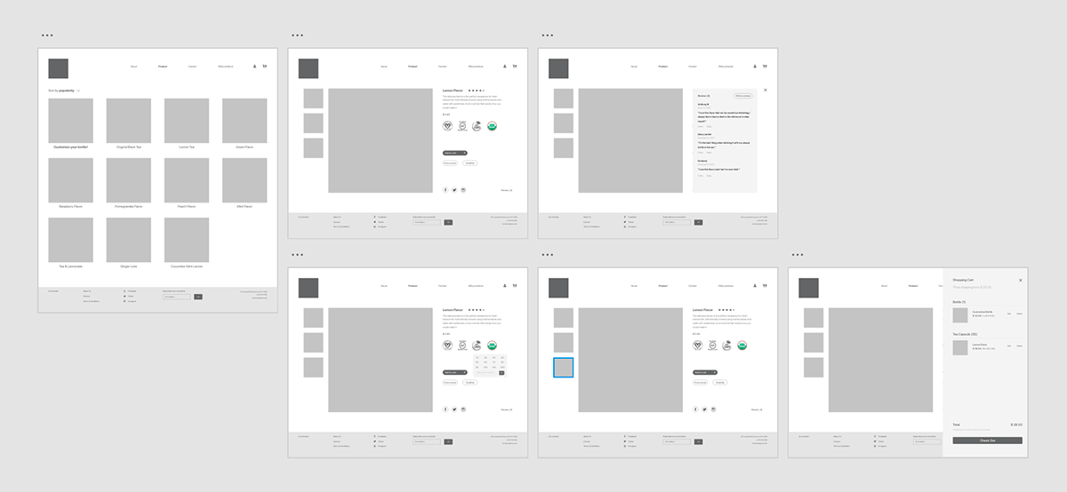
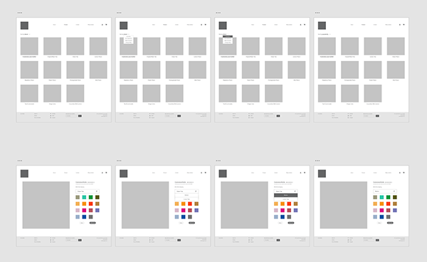
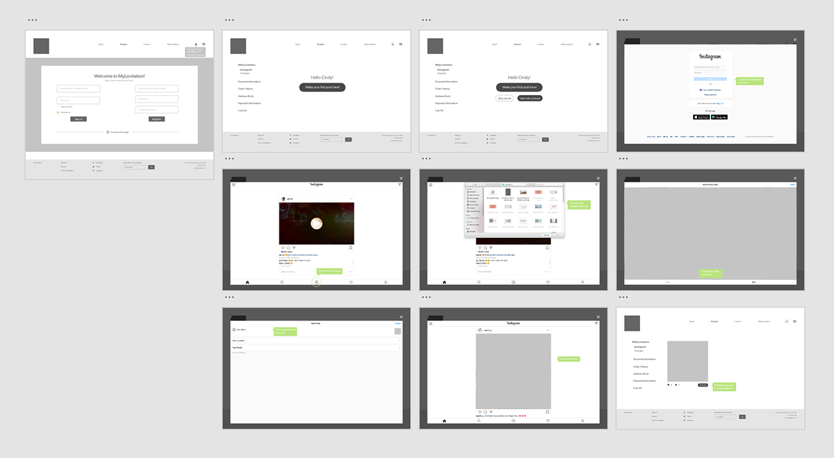
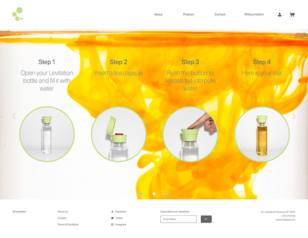
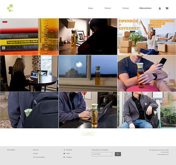
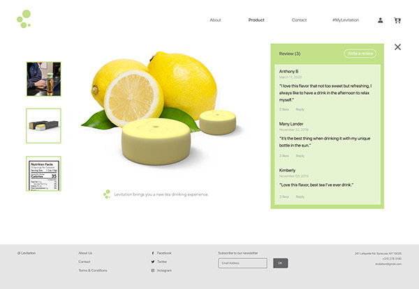
User Testing. After finishing the first website prototype based on the framework on Figma (page samples above), I found four participants and asked them test it. They gave some valuable feedback: 1). They liked the idea of using the brand website as a platform to interact with Levitation consumers and share lifestyles with each other; 2). One participant believed the customization button could be simplified; 3). participants suggested that the product page should show prices and scores for each flavor or sorting by popularity or price would be meaningless.
Landing Page
Showcase the selling points: ask customers to customize your own bottles to give them a sense of belonging. In this way to encourage people to reuse and recycle bottles.
Influencer Page
Levitation customers can connect and communicate with each others and learn more about their life styles.
Bottle Customization Page
To encourage people to reuse and recycle bottles, customers can customize your own bottles to have them a sense of belonging. In this way, the bottle service life would be longer.
Product Page
Customers can check others' reviews on particular products then decide which ones to purchase.
Profile Page
Levitation encourages young users to activate online even to be an influencer. It provides step-by-step instructions to post daily photos or videos.
