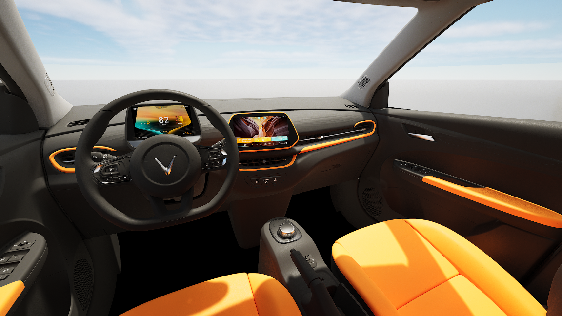
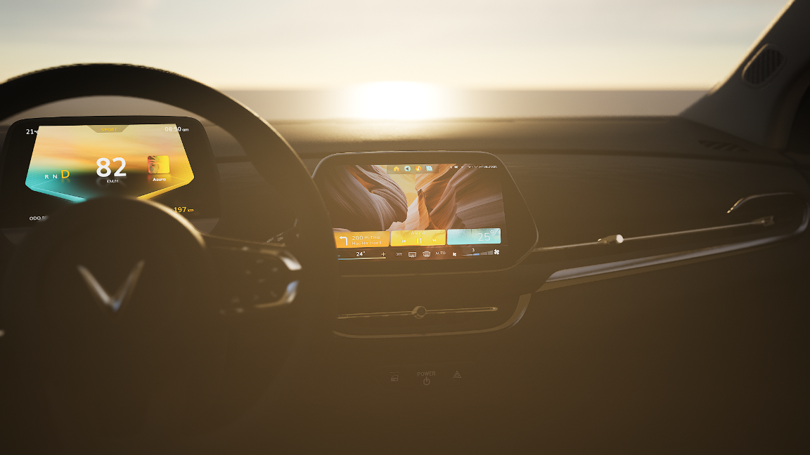
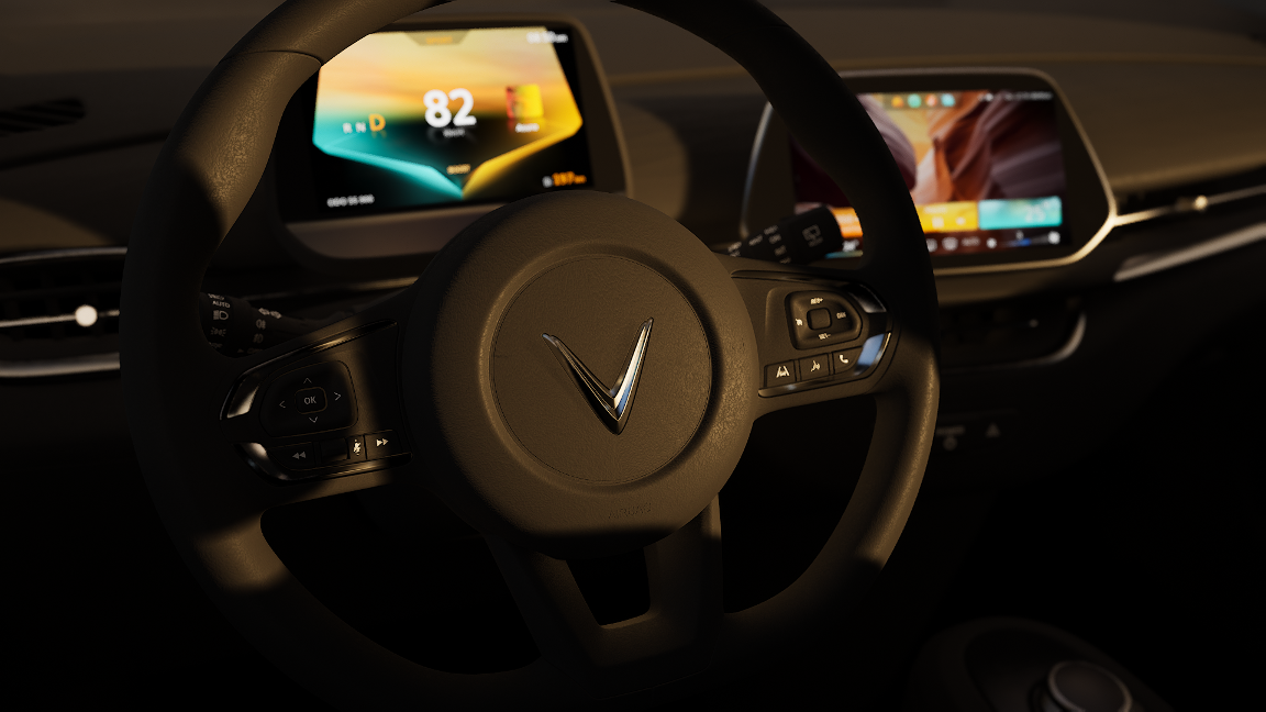
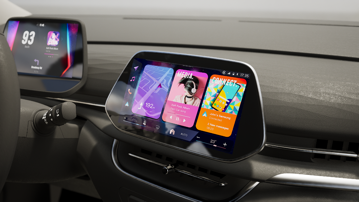
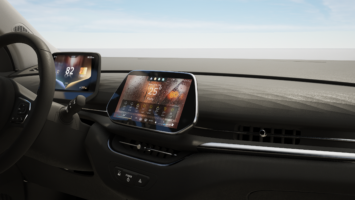
The Vision Statement: A customizable colorful but premium-looking HMI design that does not necessarily follow traditional HMI Design Rules but rather simple and easy-to-use smartphone-like usability with features like Swipe gestures when it makes sense.
In addition Font Size, Button Sizes, and readability should follow Automotive Safety Guidelines.
Our Work: This is a Three weeks design sprint, so UX and UI side advance side by side.
Link: https://miro.com/app/board/uXjVOEQY7gY=/ Password: VF2022UI
- Design Research Phase
Demographics
Consumption Trend #1

Consumption Trend #2

Social media
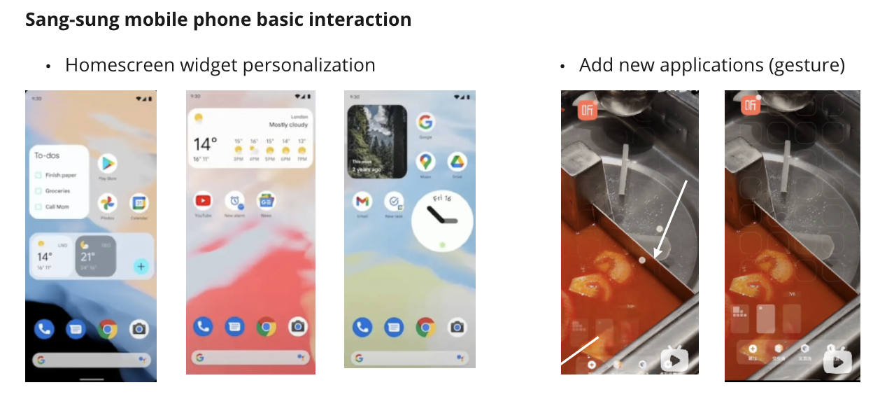
Android OS interaction method
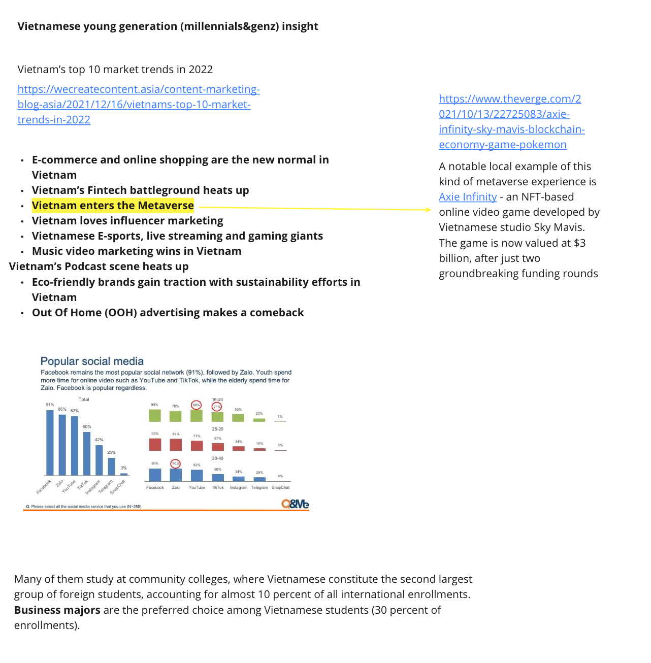
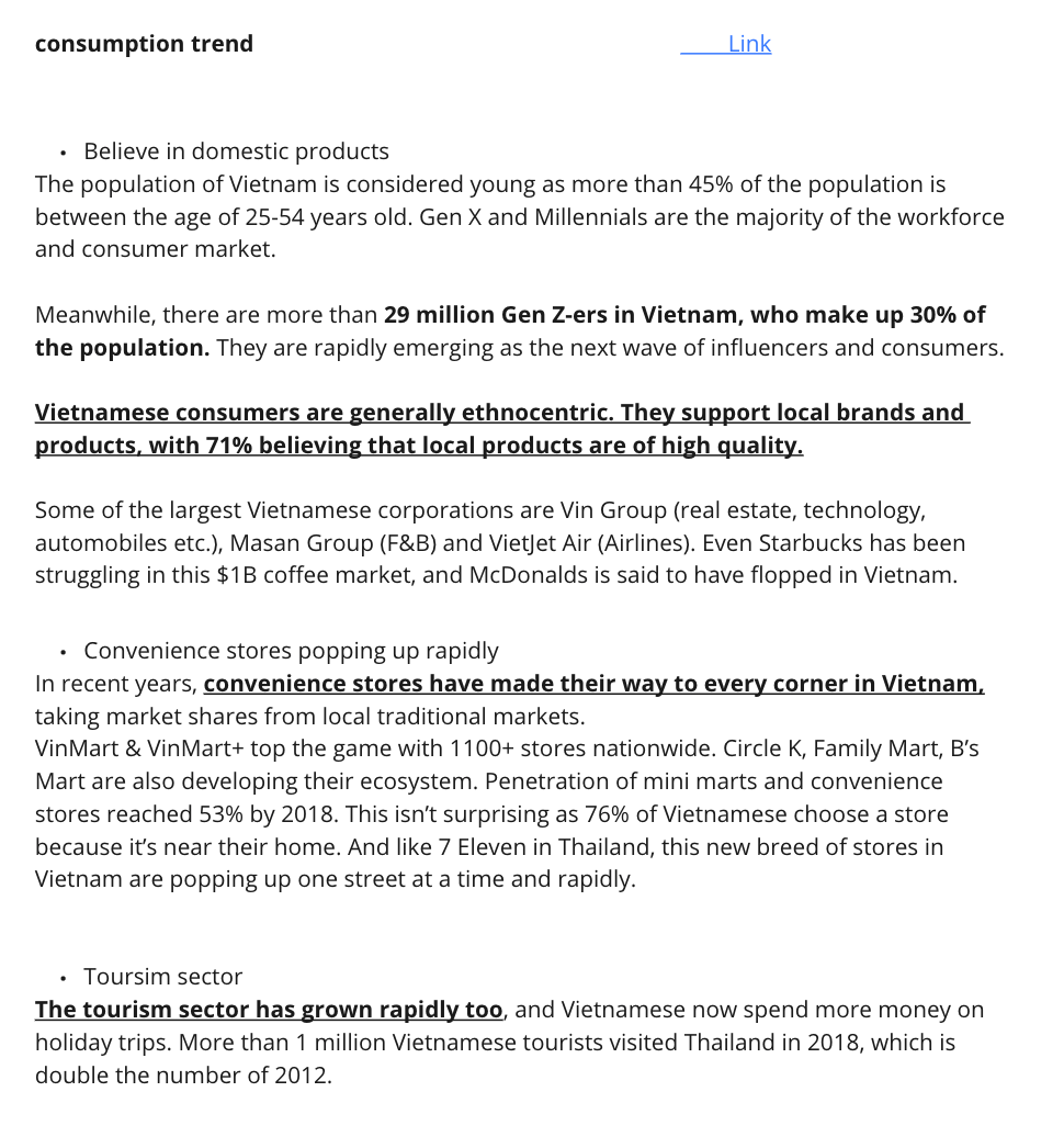
We got to learn about the Vietnamese young generation better regarding their hobbies, consumption trend, and others through Demographic Research.
Three personas and their user journey map
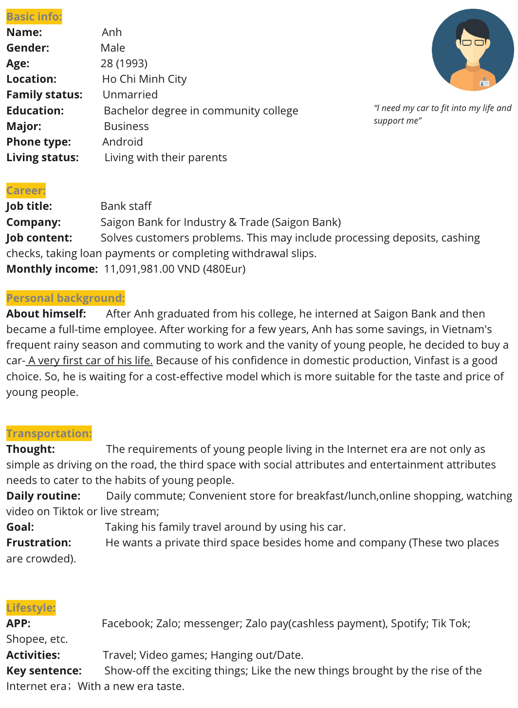
Persona #1
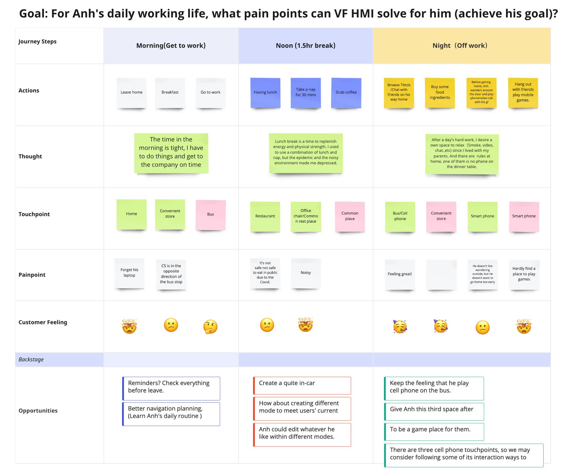
Journey map #1
- 1st persona: A bank employee. He's a very normal young man like every other young man in the world.
1. This is the very first car of Anh's life, so make it easy to use and similar to the device that he always used.
2. Recommend the corresponding mode/application at what time/place based on the user's habits or daily routine should be a way to go.
3. Like most normal office workers around the world, Anh's needs for the main functions (Navigation, music, calendar,.etc.)of the car are not very different from theirs.
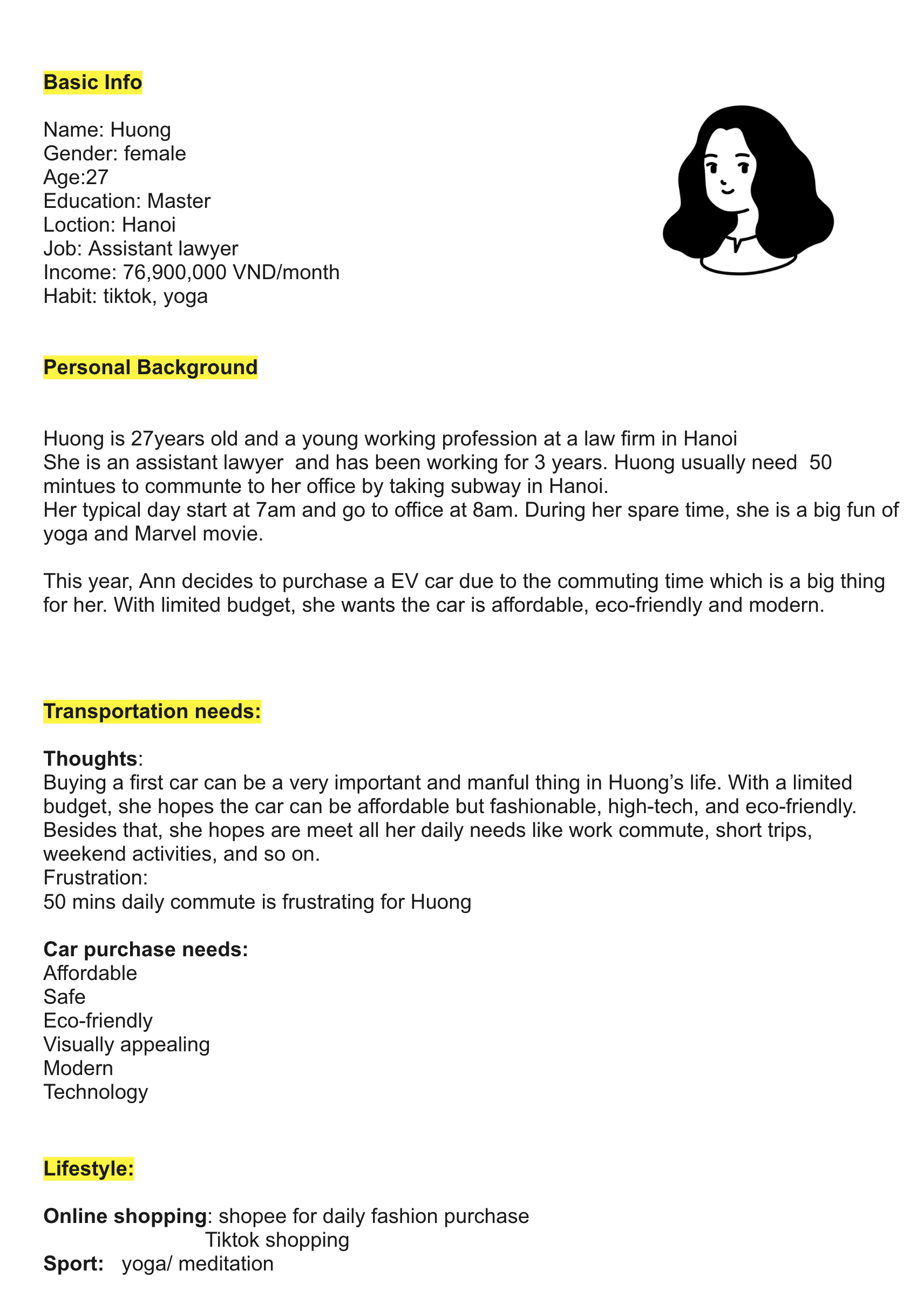
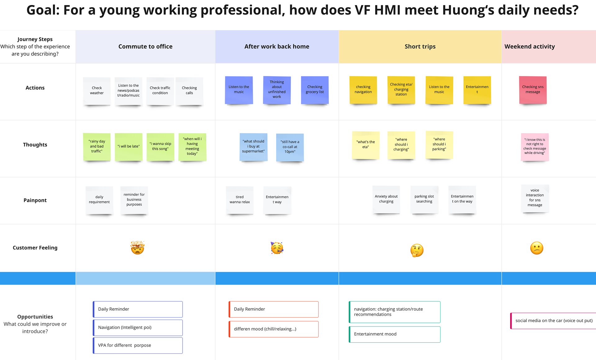
- 2nd persona: A businesswoman.
1. Meet with daily needs (navigation/ music/ vehicle control/etc)
2. Flexible operation system, great Multi weight interactive experience
3. Meeting with mobile behavior (shortcuts/grouping weights/gesture control?
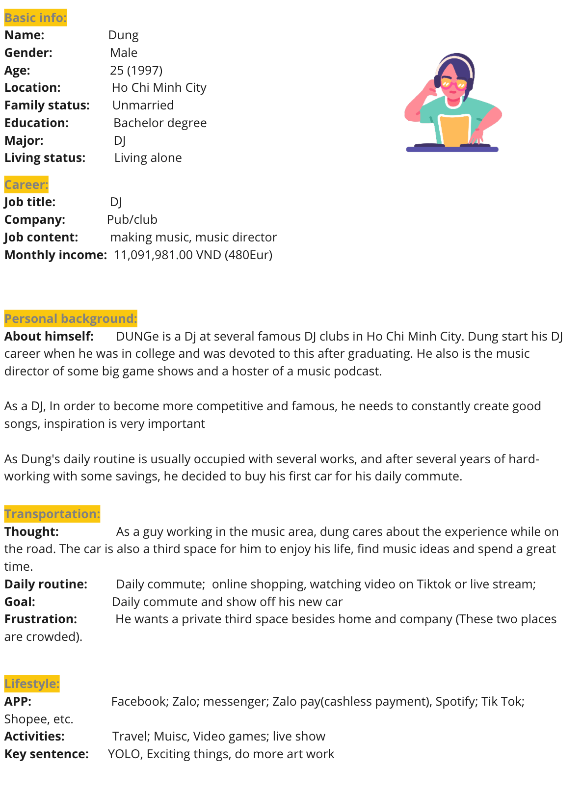

- 3rd A DJ
1. Immersive driving experience (music mode)
2. Visual design meet with different mode (music/chill&relaxing/morning mode etc)
HMI Guideline
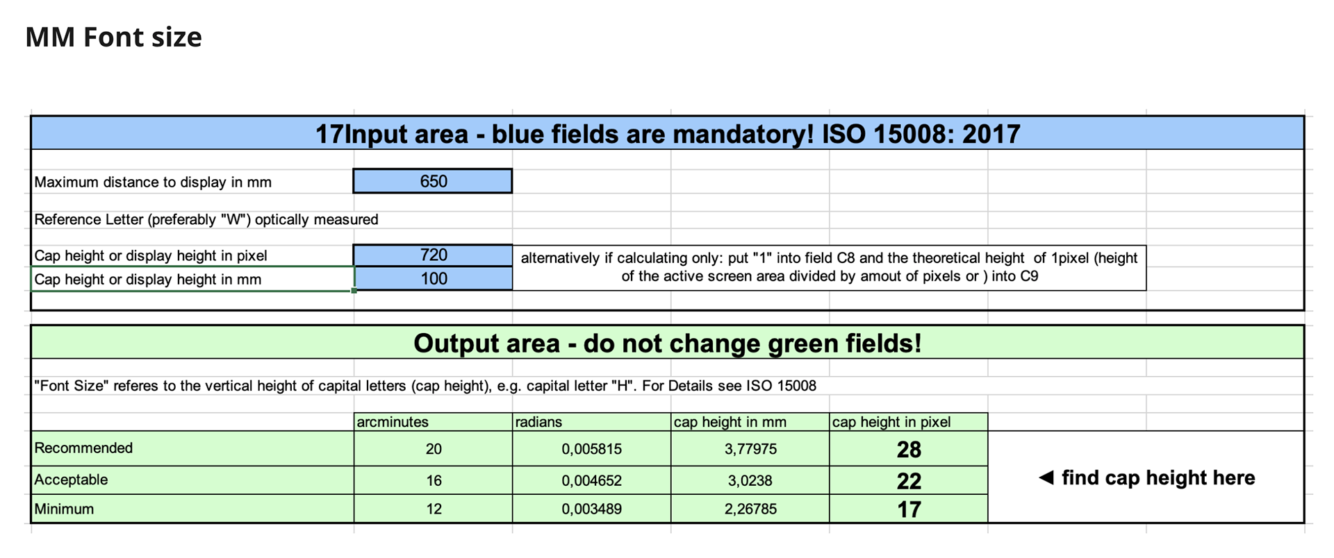
MM font size

MM button
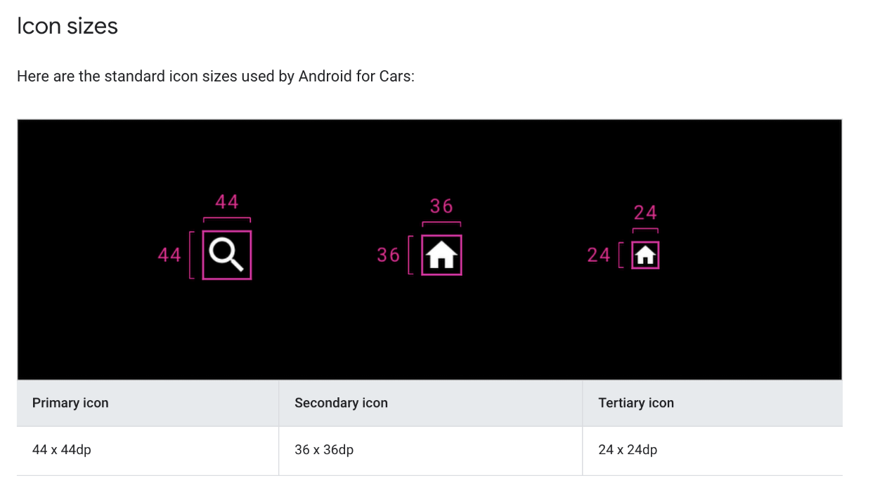
Icon
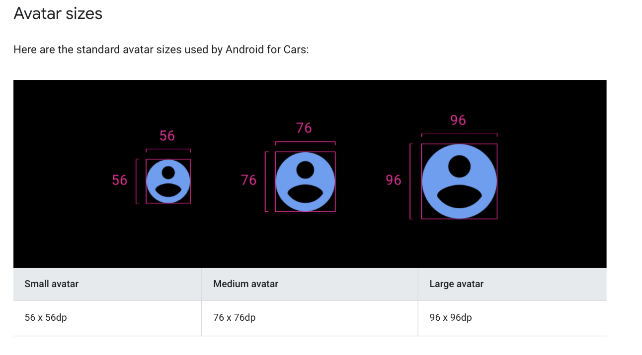
Avatar
- Design Proposal Phase
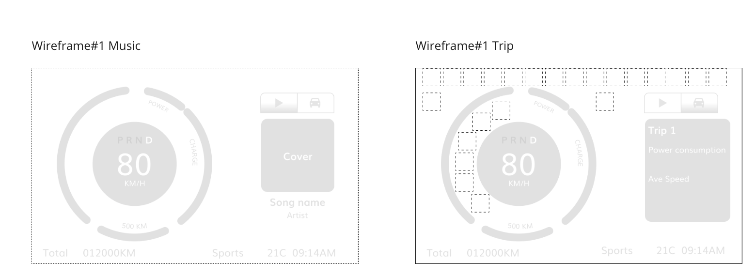
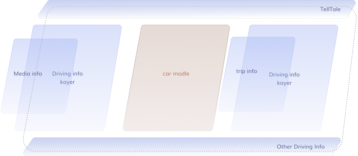
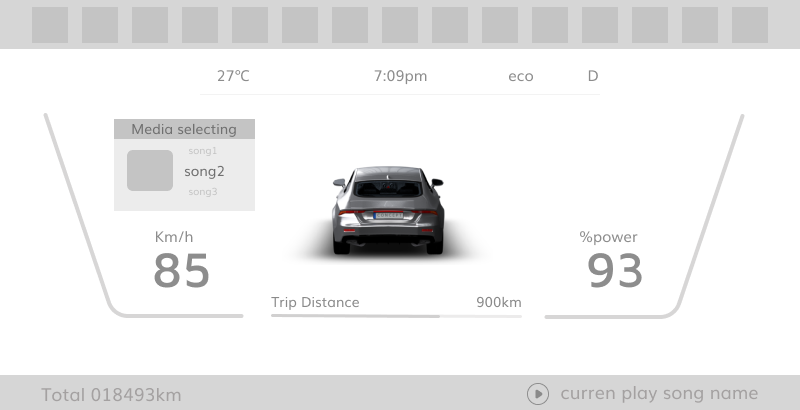
Instrument Cluster (IC) proposals


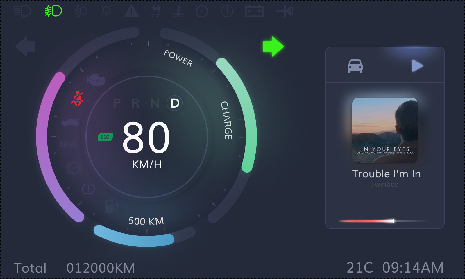


Twilight
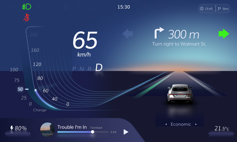
Morning
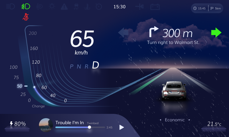
Twilight with rainy
Proposal 3



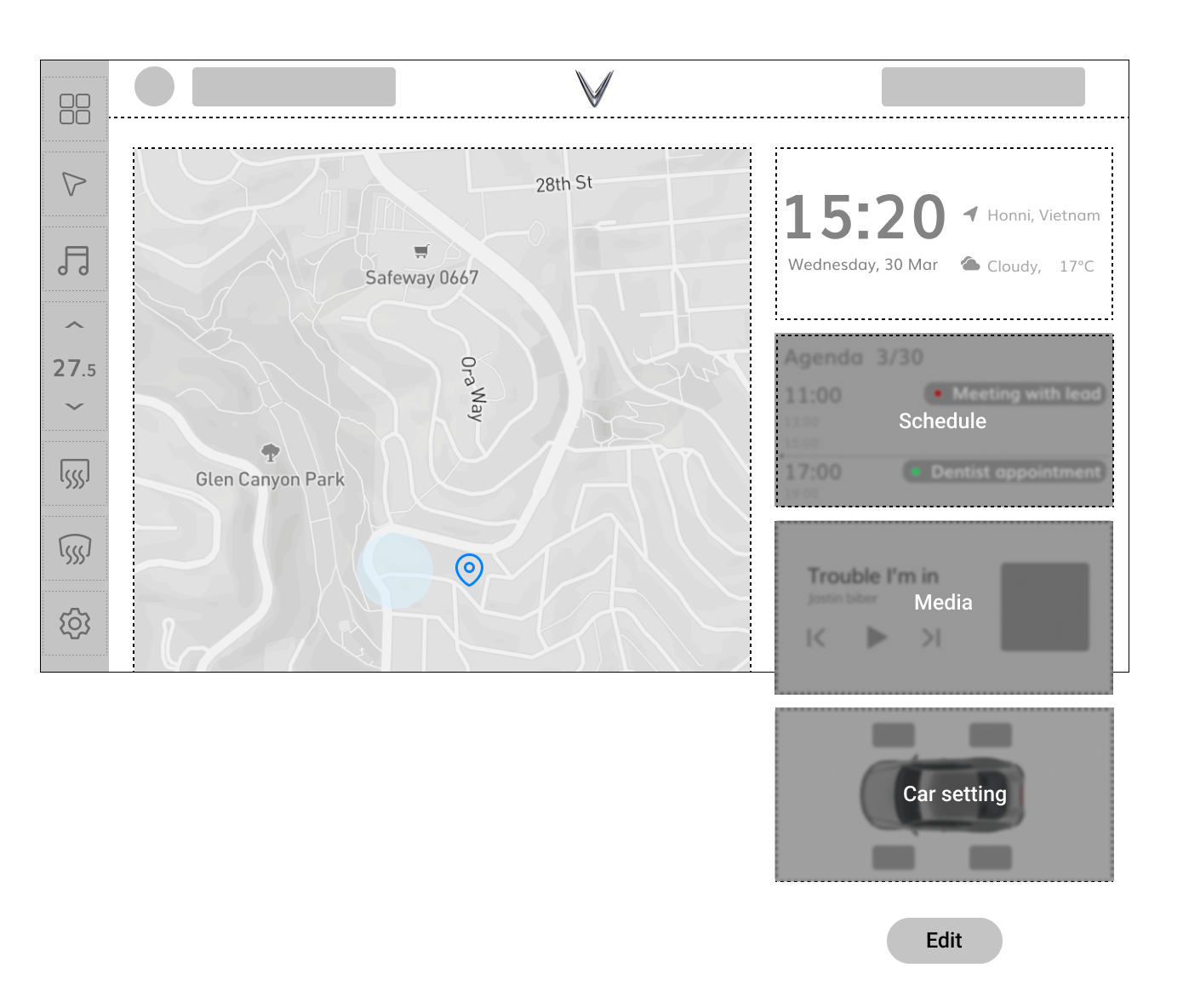
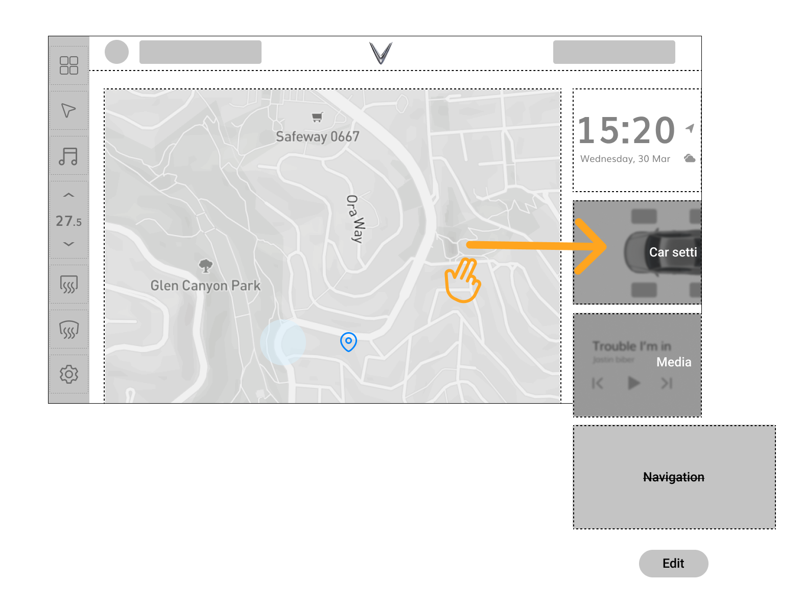
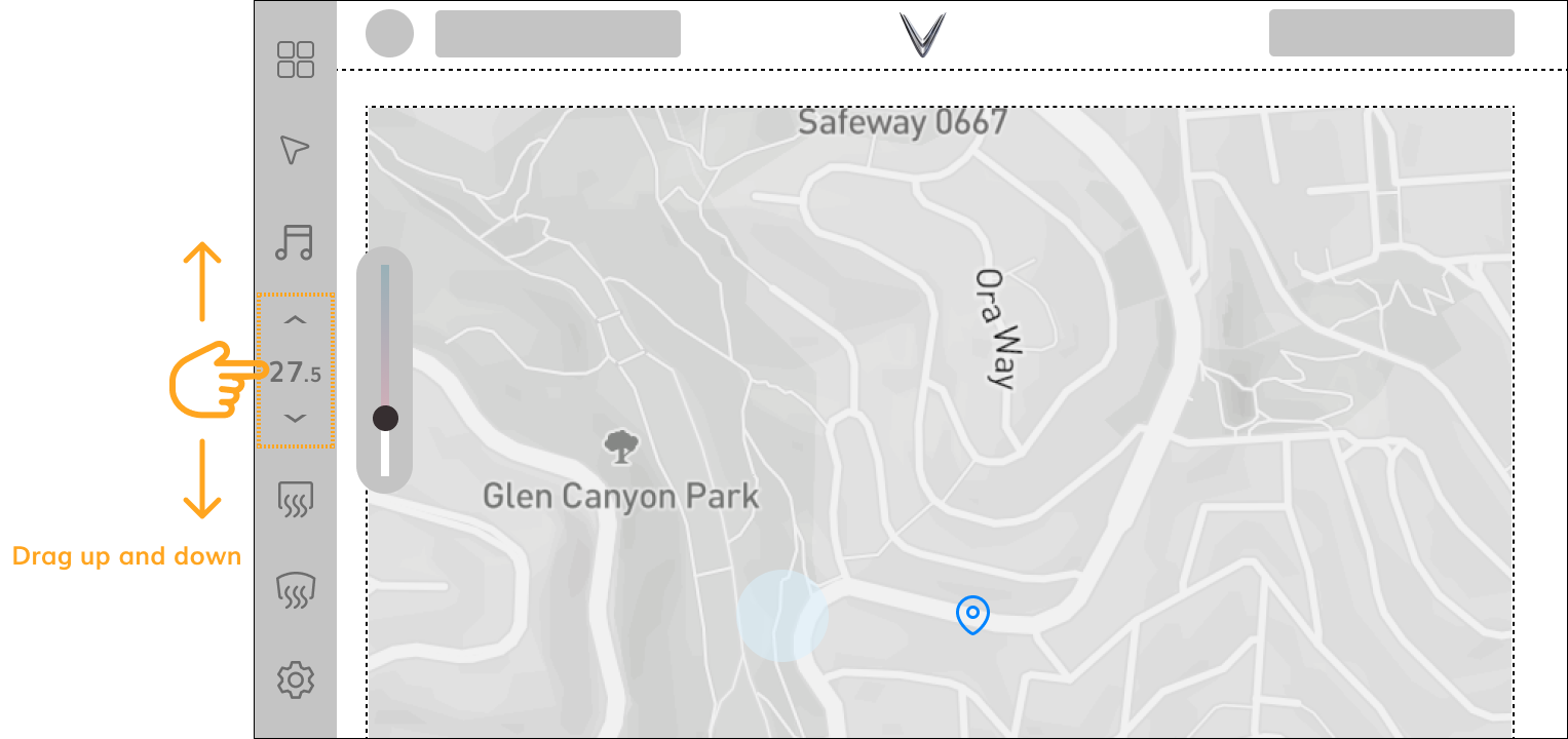
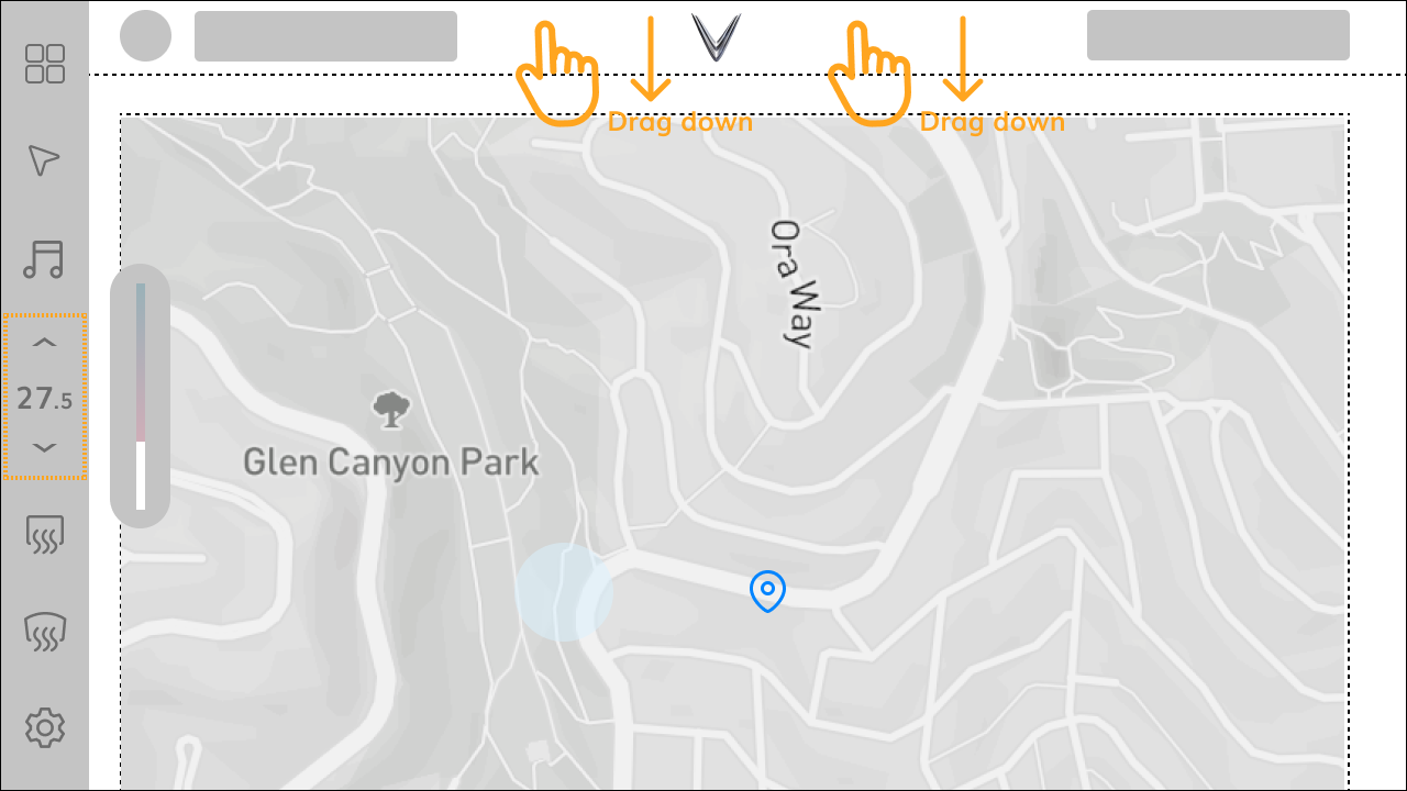
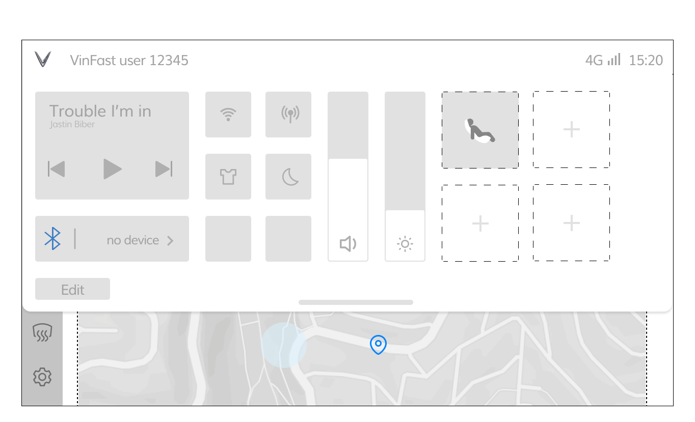
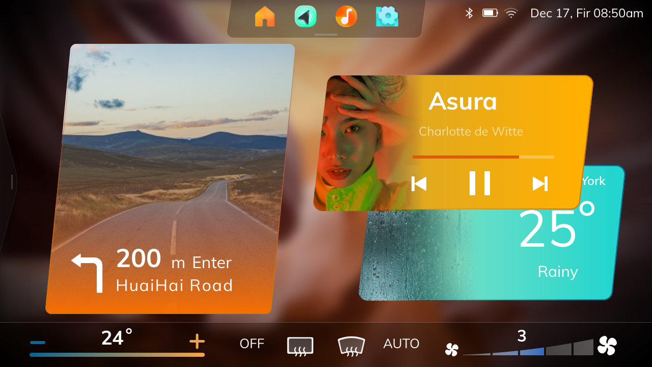
Head Unit (HU) proposals


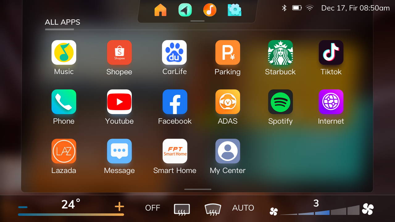
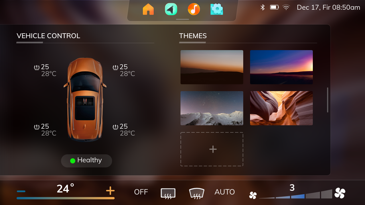


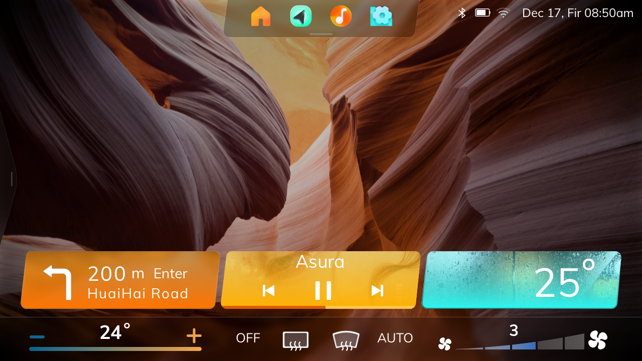
In-car impression
